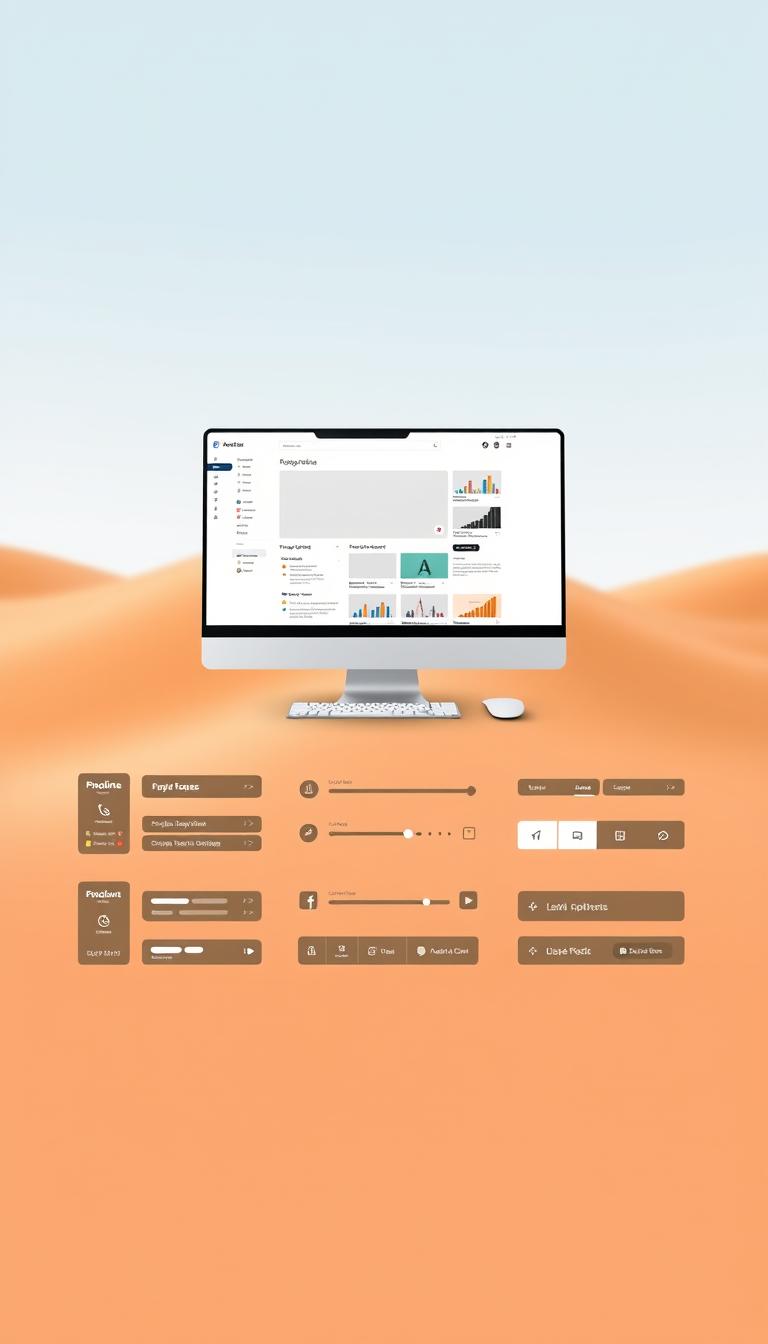
A well-designed user interface is key to a website’s success. It greatly improves the user experience and boosts conversions.
A great UI design changes how visitors use a website. Knowing the basics of UI design is vital. It helps make a website both effective and user-friendly.
Key Takeaways
- A well-designed UI is crucial for a website’s success.
- Good UI design improves the overall user experience.
- Effective UI design drives conversions.
- Understanding UI design basics is essential.
- A user-friendly website is a result of good UI design.
Understanding User Interface (UI) Basics
Knowing the basics of user interface is key for any web design project. A well-made UI makes the user experience better. It makes things easy and fun for users.
Definition of User Interface
The user interface is what users see and interact with in digital products like websites or apps. It includes the layout, typography, color schemes, and graphics. These elements help users interact smoothly.
Importance of User Interface in Web Design
A good UI design supports the UX strategy. It makes sure the digital product looks good and works well. It’s key in how users see and use the product.
The role of UI in web design is huge. It affects user happiness, how many people buy things, and the product’s success.
Key Components of User Interfaces
The main parts of user interfaces are buttons, typography, icons, and color schemes. These must be designed well to make a smooth and easy interface.
- Buttons and interactive elements that respond to user actions.
- Typography that is easy to read and consistent.
- Icons and graphics that make the UI look good and work well.
By paying attention to these parts, designers can make a UI that works well and looks great. This improves the user experience.
Principles of Effective User Interface Design
Understanding UI design principles is crucial for creating user-friendly interfaces. Good user interface design makes a big difference in how users interact with websites or apps.
Consistency and Standards
Consistency in UI design means using the same elements everywhere. This includes typography, color schemes, and button styles. It makes navigation easier for users because they know what to expect.
Key aspects of consistency include:
- Uniform typography and font sizes
- Standardized color schemes and button styles
- Consistent layout and spacing
Keeping things consistent makes the interface both beautiful and easy to use.
Visibility of System Status
The interface should always keep users updated on its status. This includes loading animations, progress bars, and notifications.
Effective visibility of system status involves:
- Clear and timely notifications
- Intuitive loading animations
- Visible progress indicators
Keeping users informed reduces anxiety and makes for a better experience.
User Control and Freedom
User control and freedom mean users can interact with the interface as they wish. They should feel free to make choices without feeling trapped.
| Feature | Description | Benefit |
|---|---|---|
| Undo and Redo | Allows users to correct mistakes | Reduces user anxiety |
| Clear Navigation | Provides users with a clear understanding of their location within the interface | Improves user confidence |
| Customizable Settings | Allows users to personalize their experience | Enhances user satisfaction |
By giving users control and freedom, designers can make interfaces that are both intuitive and fun to use.

Analyzing Your Current User Interface
To make your website better, start by checking how it looks now. Looking at your current user interface helps you see what needs to get better.
Conducting a UI Audit
A UI audit is a deep look at your website’s design. It checks the layout, how easy it is to navigate, the fonts, and how it looks overall.
When doing a UI audit, think about these things:
- Is the design consistent?
- Is it easy to find your way around?
- Does it work well on all devices?
- Is it accessible for everyone?
Gathering User Feedback
Getting feedback from users is key to knowing how they use your website. You can use surveys, user tests, and feedback forms to do this.
User feedback can tell you a lot, like:
- What’s hard to use?
- Where do users get lost?
- What do users like most?
Identifying Pain Points
Finding out what hurts your user interface means looking at feedback and how users act. It’s about finding what makes them frustrated or have trouble.
Some common issues include:
| Pain Point | Description | Potential Solution |
|---|---|---|
| Complex Navigation | It’s hard to find stuff because the menus are too complicated. | Make the menus simpler and organize your site better. |
| Slow Loading Times | Pages take too long to load. | Make images smaller, use browser caching, and reduce HTTP requests. |
| Non-Responsive Design | The site doesn’t look right on different screens and devices. | Use a design that changes to fit any screen size. |
By really looking at your website, listening to what users say, and finding out what’s hard, you’ll know a lot about it. This knowledge is key to making your website better. It helps you design and test your user interface to make it more friendly and useful.
⭐️ Tap the exclusive deal link https://temu.to/k/uot8tcxvwum to score top-quality items at ultra-low prices. 🛍️ These unbeatable deals are only available here. Shop now and save big! ⭐️ Directly get exclusive deal in Temu app here: https://app.temu.com/m/mhb5rstagbx
Another surprise for you! Click https://temu.to/k/uag0bn0o0wd to earn with me together🤝!
Best Practices for User Interface Design
Designing user interfaces for different devices and user needs is key. By following best practices, designers can make interfaces that are easy to use and accessible. This improves the user experience.

Mobile-First Design Approach
Using a mobile-first design approach is essential today. Most people use mobile devices to access websites. Designing for small screens first ensures the UI’s essential elements are prioritized.
This method simplifies layouts and focuses on key content. It makes sure the UI is intuitive and easy to use on small screens. This way, designers can ensure a smooth experience on larger screens too.
Designing for Accessibility
Designing for accessibility is crucial in UI design. It means creating an interface that everyone can use, including those with disabilities. Following accessibility guidelines, like the Web Content Accessibility Guidelines (WCAG), is important.
Designers should think about color contrast, font size, and screen reader compatibility. This makes the UI accessible to more people. It improves the user experience and ensures the website is usable by all.
Ensuring Responsive Design
Ensuring responsive design is key for a consistent user experience. Responsive design adjusts to different screen sizes and devices. This ensures the UI works well on various platforms.
Designers use flexible grids, images, and media queries for responsive design. This makes the UI adapt to different screen sizes. It keeps content accessible and easy to navigate.
By following these best practices, designers can create UIs that work well on different devices. This enhances the user experience for everyone.
The Role of Color in User Interface
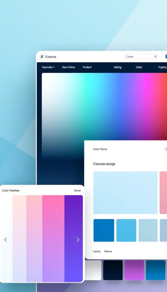
Color plays a big role in making user interfaces work well. It can guide how users interact with a site or app. The right colors can draw attention, show meaning, and even make users feel certain ways.
Psychological Impact of Color
Colors affect us deeply. Each color can make us feel something different. For example, blue makes us feel safe and stable. On the other hand, red tells us something is urgent or important.
Knowing how colors affect us is key to good design. It helps designers create interfaces that users love.
Color Schemes and Branding
A good color scheme is essential for a brand. It makes the brand easy to recognize. Using the same colors everywhere helps keep the brand strong.
Choosing colors should match the brand’s personality. Color harmony rules, like using colors that go well together, make the interface look great.
Tools for Choosing Colors
There are many tools to help pick the right colors. Color palette generators like Adobe Color and Coolors help find matching colors. Sites like Color Hunt and Paletton offer color palettes and check for accessibility.
It’s also important to make sure text is easy to read against the background. Tools like Snook’s Colour Contrast Checker check if the colors work well together.
Typography in User Interface Design
Typography is key in UI design, shaping how users see and use digital products. Good typography makes content easy to read and access.
Legibility: The Foundation of Good Typography
Legibility is vital in UI design. It affects how users read and get the content. Choosing clear fonts is crucial for a good user experience.
Designers should think about font size, line height, and text-background contrast. A well-thought typography system boosts a digital product’s usability.

Choosing the Right Fonts for UI Design
Picking the right fonts is essential in UI design. The right fonts can improve the design, while the wrong ones can harm the user experience.
Designers should match the font to the brand and the digital product’s use. For example, Open Sans is great for digital interfaces because it’s clear on screens.
| Font Type | Characteristics | Best Use Case |
|---|---|---|
| Serif | Classic, traditional feel; decorative serifs | Print media, formal documents |
| Sans Serif | Modern, clean, highly legible | Digital interfaces, UI design |
| Script | Flowing, connected letters; can be decorative | Headings, titles, branding elements |
Hierarchy of Information through Typography
Creating a clear information hierarchy is crucial in UI design. It helps users follow the content logically. Typography is key in setting up this hierarchy.
By changing font sizes, weights, and styles, designers can show differences between headings, subheadings, and body text. This makes it easier for users to find their way through the content. A clear hierarchy is essential for a smooth user experience.
Incorporating Visual Hierarchy
A clear visual hierarchy is key to guiding users through your interface. It makes sure the most important parts are seen first. This boosts the user’s experience.
Understanding Visual Hierarchy
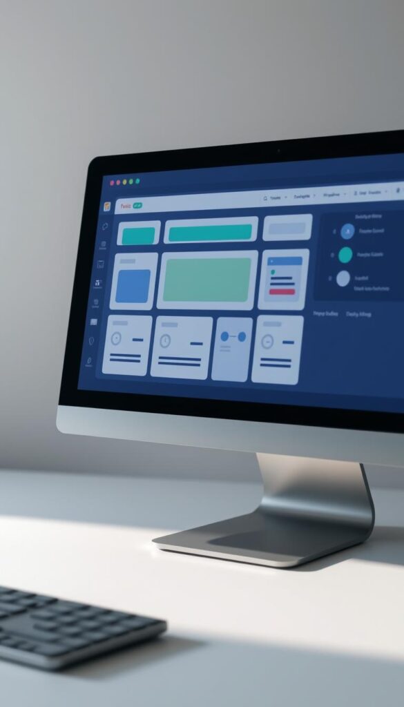
Visual hierarchy is about arranging elements in order of importance. It uses size, color, and position to focus the user’s attention. Effective visual hierarchy makes the interface easier to use.
Techniques for Effective Layouts
There are several ways to create a good visual hierarchy. These include:
- Using size and scale to show the difference between main and secondary elements.
- Employing color contrast to make important features stand out.
- Strategically placing elements to guide the user’s eye through the interface.
- Utilizing whitespace to reduce clutter and improve readability.
Importance of Whitespace
Whitespace, or negative space, is vital in visual hierarchy. It helps cut down on clutter, making the interface easier to read. Proper use of whitespace makes websites or apps clearer and more user-friendly.
By understanding and using visual hierarchy, designers can make interfaces that look good and work well. They become more functional and easy to use.
Tools for User Interface Design
In UI design, the right tools are essential for making interfaces both intuitive and beautiful. The design process includes wireframing, prototyping, and testing. Each step needs special tools.
Popular Design Tools and Software
Many design tools are popular among UI designers. Sketch and Figma stand out for their features and ease of use. They help designers make detailed prototypes and work together in real-time.
Adobe XD and InVision are also key. They offer tools for testing and refining designs. Designers can get feedback and tweak their work to meet user needs.
| Tool | Primary Function | Collaboration Features |
|---|---|---|
| Sketch | Digital Design | Yes, through plugins |
| Figma | UI/UX Design | Yes, real-time collaboration |
| Adobe XD | UI/UX Design and Prototyping | Yes, integrated with Adobe tools |
Prototyping and Wireframing Tools
Prototyping and wireframing are vital in UI design. They let designers test and refine their ideas. Axure and Proto.io help create interactive prototypes. This way, designers can see how users might interact with their designs.
Wireframe.cc and Moqups are great for making simple wireframes. These are crucial for planning a UI’s layout and functions.

Collaboration Tools for Design Teams
Good teamwork is essential for UI design success. Tools like Slack and Trello help designers communicate and manage projects. This ensures everyone is on the same page.
Storybook and Bit are also important. They help teams keep their designs consistent by storing UI components in one place.
Evaluating Your User Interface Design
Checking your user interface (UI) design is key to spotting areas for betterment. A good UI design keeps users engaged and boosts your website’s performance. It’s all about making your site easy to use and fun to explore.
Key Performance Indicators
To see how well your UI works, watch metrics like bounce rates, time on page, and conversion rates. These numbers tell you how users feel about your site. They help you find spots to make your UI better.
Testing and Iteration
A/B testing is great for seeing which UI parts work best. Always keep updating your design based on what users say and test results. This keeps your UI fresh and meets user needs.
By constantly checking and improving your UI, you’ll make your site more enjoyable. This leads to more user interaction and higher conversion rates. Your website will run better, thanks to your hard work on UI optimization.
